One of your fellow classmates forwarded me these sites for the possibility of having your books or final projects printed and bound. Check them out, even if for future reference!
Friday, November 30, 2007
printing options
Tuesday, November 27, 2007
A juror's voice
 I came across th following statement from the juror of the latest Western issue of New American Paintings. I thought it was interesting in light of our focus on self-promotion and the process of being judged. It deals specifically with painting, but can easily be applied to the issues we have been and will be looking at as you prepare for your final project. Here's a view from the "other side"...
Nick Capasso, Curator, DeCordova Museum and Sculpture Park, Lincoln, MA:
"The workings of the art world are veiled in mystery, not just to outsiders, but to insiders as well. In the realm of Culture, the objective yardsticks applied by science, economics and raw politics simply do not—and cannot—apply. Other, shiftier, modes of analysis take precedence: taste, fashion, cele-brity, critical theory, art history, aesthetics, psychology, emotion. But the players in the art world rarely agree upon any of these things. This constant uncertainty is magnified by the conditions under which art is bought and sold. Works of art are strange philosophical commodities, routinely auctioned—like cows, repossessed cars and foreclosed real estate—for increasingly astronomical prices in an entirely laissez-faire market with virtually no regulation. Anything goes, and it’s in the best interests of those who want to make money to conceal or misrepresent their inner workings from everybody. Thus, what happens in the art world is usually inexplicable. Nothing is as it seems. We stand in a house of mirrors, built on shifting sands, while contemplating the emperor’s new clothes.
Well, frankly, I’m sick of it, so I try at every opportunity to be as transparent about what I do as a curator as is humanly possible. All this mystery is bunk. So, in this introductory juror’s essay to New American Painting’s 2007 issue on the Western Region, I will seek to explain why I did this, how I did this and what I observed about contemporary painting along the way. I was delighted when The Open Studios Press invited me to serve as juror for this issue. I love the jurying process because it sharpens my eye and mind, gives me a broad sense of the current aesthetic concerns of the community in question, and brings to my attention artists with whom I had not been familiar. The more I see, and think about what I see, the better I can do my job. And, since I work at a primarily regional art museum (the DeCordova focuses primarily on artists in the six New England states), the regional approach of New American Paintings is of interest to me. I certainly do not believe in any kind of 21st-century aesthetic or stylistic regionalism, but I do support geographically diverse cultural structures as a slight corrective to the New York/London/Beijing axis. Not all great art devolves upon three cities, nor is culture as “global” as those who can afford to travel at the drop of a hat seem to think. Also, I was especially pleased to review paintings by artists from the West, the region of this country where I have spent the least amount of time.
As juror, I considered work submitted as 35mm color transparencies (slides which I projected), or as prints. In making my selections, I used the following criteria: formal cohesion across the entirety of the image, technical mastery of the medium, content that was either original or presented in a particularly eloquent way and an organic dynamic unity of form/style/content/subject. I was most passionate about paintings that stood out from the overall pool by grabbing my attention and/or providing a substantial intellectual or visual pleasure. Along the way I was mindful of the limitations imposed by seeing artwork in reproduction, particularly the tendency of projected slides to alter color relationships, erase texture and confound scale. In sum, I evaluated the submitted images with the exact process that I use to review unsolicited materials from artists at the DeCordova Museum: I selected the paintings that I would most like to experience in person..."
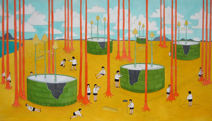
Image above: Dana Costello, who has appeared in New American Paintings
Wednesday, November 21, 2007
Thursday, November 15, 2007
textural inspiration

Check out this book by designer/illustrator Von R. Glitschka which offers textures to back digital work. Admire the effects and the idea... and then scan some of your own textures as a way to sweeten up your digital world.
Wednesday, November 14, 2007
The wily world of self-promotion
To get you mulling, here are some links and stories about the process of getting your work out and into the hands of those who've been looking for you...
*Children's book illustrator, Holli Conger's Process.
*New York Foundation for the Arts has some helpful tips.
* Creative Latitude lends a hand for thinking about theme and approach.
*And finally, check Keri Smith for someone who was born to encourage artists.
Thursday, November 1, 2007
Tuesday, October 23, 2007
graphic novels and comics for adults

children's book resources
-> The evolution of the illustrated children's book. A terrific broad overview of the medium. Includes sculptural alphabet boxes, pop-ups and board games.
Some big hitters from the last century (when we were all born):
Dr. Seuss
Maurice Sendak
Arthur Rackham
Maxfield Parrish
Beatrix Potter
Shel Silverstein
Eric Carle
Richard Scarry
Wednesday, October 10, 2007
to vector or not to vector

Last class, we joked about Photoshop being better for illustration than Illustrator. But there are times when a vector-based program best serves your purpose. Nice clean lines and bold colors can be made in Photoshop, but there's something about that slick geometric Illustrator effect...
Check out the links below for examples of styles that would work well in vector:
Frances Castle
Chris Garbutt
David Hitch
Steve May
Christiane Beauregard
Jason Greenberg
Helen Dardik
Catalina Estrada
(the image above is one of Ms. Estrada's)
Wednesday, October 3, 2007
scanner players
 Here are some early (as in, eighties and nineties) uses of (then) new tools toward artistic ends... Above is a manipulated scan by artist Dieter Huber, who, in his Klone series (1994), took biological realities and adjusted them to make comments on sexuality, genetic engineering and perfection.
Nancy Burson, using morphing software, also commented on the perception of beauty and perfection by, for example, joining all of the faces of beauty icons from different eras:
 First and Second Beauty Composites (First Composite: Bette Davis, Audrey Hepburn, Grace Kelley, Sophia Loren, and Marilyn Monroe. Second Composite: Jane Fonda, Jacqueline Bisset, Diane Keaton, Brooke Shields, and Meryl Streep), 1982
Joseph Scheer's images of moths are simple, elegant celebrations of the patterns of the natural world. Because he uses a scanner to capture moth wings, we get a hyper-real picture when he blows them up to poster-sized prints. How is a scanned image different in effect from the single-lens effect of a camera eye? Which type of image is closer to the perception our own eyes and brains?
Thursday, August 16, 2007
Introduction
 {image: video still from The First Five Fathoms, Zack Bent}
This will be a resource for links, opportunities, inspiration, etc. for my Digital Illustration class this Fall at Seattle Pacific University. Cheers!

