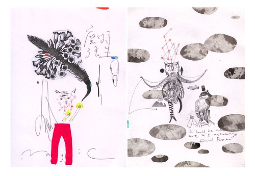
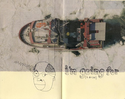
Modern art mythology contains a story of a group of artists looking for a name for their movement, in which absurdity and irreverent thought experiments were the order of the day. One member opened a dictionary and blindly pointed (some even say he stabbed it with a knife) at the word "Da-da" -- a French word for hobby horse. Thus was born Dadaism, a term Wikipedia claims would not even have been embraced by its practitioners. Alas. In this spirit of chance and play, I asked my sons to each give me three words, and then found articles that related to them. Find, below, your assignments for two spot illustrations. I'll send you, by email, your assigned number.
1 BEE
Wednesday, October 21, 2009
Saturday, October 17, 2009
Process, process, process.
Take a look at this detailed account of the process of illustrating for a big, high profile job by John Hendrix.
Friday, October 9, 2009
glueless collage
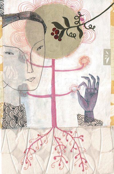
What?! No Mod Podge? Digital collage can be seamless or purposefully clunky, depending on your approach. Take note of these illustrators to see a quick sampling:
Elke Ehninger (image above)
Julie Blackmon
Marci Roth
Raoul Weiller
Marty Blake
Hanoch Piven
Ellen Weinstein
W.C. Burgard
Public Domain Images
Thursday, October 8, 2009
Saturday, June 6, 2009
Thursday, June 4, 2009
Thursday, May 28, 2009
text by hand

Here are some links to artists who do magical things with hand drawn or painted text.
Ray Fenwick
John Hendrix
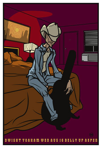
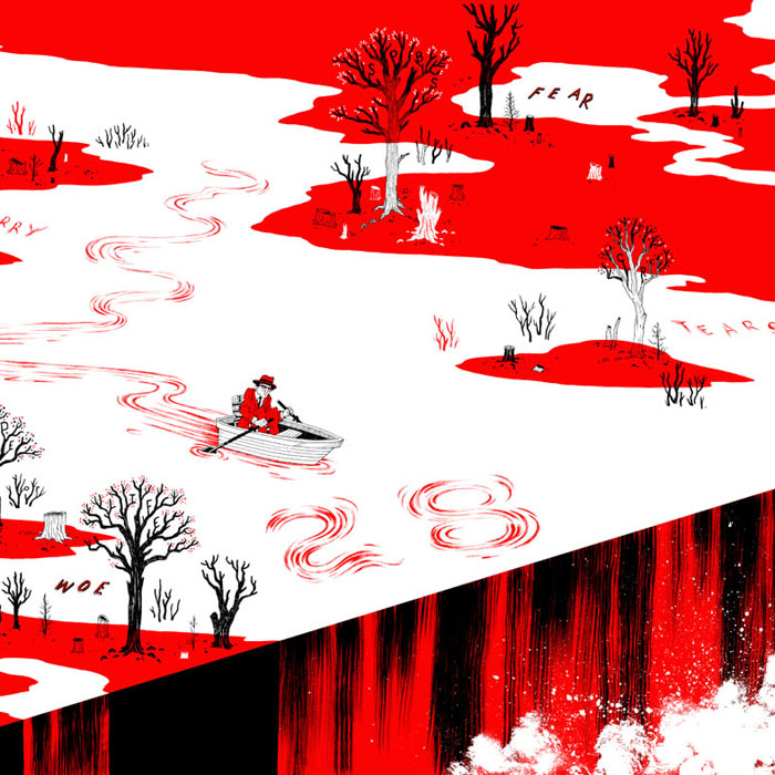
Grady McFerrin (poster example, above ^^)
Kate Bingaman-Burt
Ralph Steadman
Kate O'Connor
Andy Rementer
Wednesday, April 29, 2009
Tuesday, April 14, 2009
editorialize us
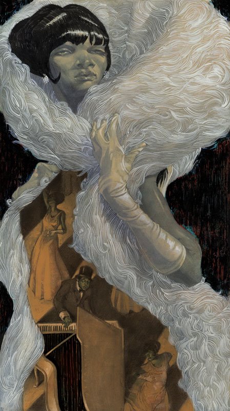.jpg)
Above: Sterling Hundley... new work for Arena Stage's production "Duke Ellington's Sophisticated Ladies"
Just a few illustrators who bring a great flair and flavor to editorial illustration:
Penelope Dullaghan
Craig Frazier
Red Nose Studio
Sterling Hundley
Monday, April 6, 2009
Jillian Tamaki clinic on idea blocks
Below is a fully transcribed blog entry by Jillian Tamaki, about the process of brainstorming and overcoming artist's block. (I would have just linked to it, but her blog isn't set up to be able to link to static pages for individual entries)
Idea Generation
[Below is a handout that for a little talk I gave on concept generation for my class at Parsons. I thought maybe you would enjoy it, since Frank seems to get a great reception when he gets all "talky" and informative.Following this guide will not guarantee you success, conceptually, professionally, or otherwise. It's just my way of working and I know for a fact it will not work for everyone. However, I was pretty interested to read that Chris Neal, someone whose work I really admire, follows a similar sort of process.
I do not address many important things in this little blurb, including the importance of aesthetics, appropriateness, marketability, and taste. These things may arguably be more important than conceptual prowess, since I don't think you need to be especially smart to be successful. Not that I consider myself exceptionally smart.]

WHAT ARE CONCEPTS AND HOW DO I GET ‘EM?
Concepts are Ideas. Some ideas are good. Some are bad. Some are offensive or insensitive. Some of them are tried-and-true (but possibly boring). Some are clever and make you laugh. Some rely on intangible things like “atmosphere” and “emotion” for their power. Some live and die on the execution (finish) of the piece.
In order for a piece to be successful, you must communicate your idea to the viewer. The viewer should be charmed, intrigued, empathetic, repulsed, provoked. SOMETHING.
They should be touched enough to want to cut the illustration out of the magazine.
How you choose to connect with viewers is up to you. There is no right or wrong, just successful and unsuccessful. There is space in illustration for personal vision and passions (in fact, illustration usually sucks when they’re absent), but we can’t forget about “the viewer” and our role as communicator.

“COMING UP WITH IDEAS”
Plunking yourself down in front of a pad of paper and scraping the inside of your brain is probably not the most effective way of generating ideas. If we only draw upon the images that already exist within our heads, or our own memories and experiences, we are actually quite limited.
Step 1. BE INTERESTED.
- Consume media. Participate in culture. Read books, go to movies, the news, fashion magazines, stupid blogs, etc. Browse the bookstore just for the hell of it. All of this contributes to our personal visual fabric. Soon you will be CONTRIBUTING to this world.
– Find inspiration in museums and the visual arts. Discover the connections between what is going on now and what has already come before. You might be surprised to learn that your favourite artist is really a knockoff of someone from 100 years ago.
Step 2. COLLECT THAT MEDIA.
- See an amazing photo/illustration/design? Save it. I keep a folder entitled “Reference” on my desktop where I keep anything I find interesting. Sub-folders include: Bodies/Gesture, Chinese Posters, Colours, Faces, Vintage Objects, Maps, Nature. A quick jog through these images can really help you out when you’re stuck for a colour scheme or composition. Or they can form the BASIS of an idea.
- As a professional, one can write-off much of the media you purchase. Books, movies, museum tickets, etc. all become professional expenses.
Step 3: TAKE THE SOURCE CONTENT SERIOUSLY.
- Read content (the book, the play, the article) carefully and thoughtfully. Several times. If possible leave a day between reading and starting work on it. Sometimes leaving it to sit in your brain for a while is very helpful, I find.
- WHILE reading content, highlight vivid imagery, key phrases, descriptive passages, notable quotes, and anything else the jumps out at you. Take quick notes or do a quick doodle in the margin if something comes to mind.
– Go find supplementary material, if necessary, to help you parse the content. If you’re doing a cover illustration for War and Peace, it may be helpful to read online discussions, dissertations, reviews, and such. The internet makes this VERY EASY.
Step 4. START WITH WORDS.
- Starting with words is quicker and more fluid because the concepts do not exist as solid representations or images yet. They make the concepts easier to manipulate.
- Use the words you isolated in Step 3 as a foundation. From here, really open your mind and think of it as a game of word association. Metaphors, symbols, verbs, colours, random thoughts and connections… they’re all important, so jot them down. Do not think in specific solutions (but if one pops in your head, make a note of it).
Step 5: ADD IMAGES.
- We think of ourselves as creative people, but the reality is that Nature is way more bizarre and interesting than anything we can come up with. Does your picture involve fish? Research variations. Does the story take place in the Texan desert? Gather some photos. You may see something in one of them that triggers a great idea (who knew cacti could look like that?).
– Try Google Image Search, GettyImages, Corbis, and Flickr. Books too (although I realize time is often short). Remember! You are drawing elements from these sources. Not transcribing or copying.
Step 6: MIX.
- By this point, you probably have some good leads as what looks interesting/what you’d like to explore. Your head is fully in the content. You’ve isolated what is important to communicate. Here are a few things to help you flesh out some usable ideas:
Combine words from the word list, even if the combinations seem strange. Unexpectedness is good.
Do character sketches. Many of them. Look at the word list and perhaps use some of the adjectives/concepts to guide your characterizations.
Sometimes thinking of COMPOSITION or DESIGN first can be helpful. Draw a thumbnail of the pleasing composition or gesture. Assign details to shapes.
Is colour very important? Build a composition to highlight it.
Look back into your Reference folder for inspiration. Sometimes you can fit your material to an existing design, colour scheme, etc.
Step 7. BUILD UP THUMBNAILS TO FINISHED SKETCHES.
- The Art Director is infinitely thankful for your research and process steps. They are going to provide her with a unique and interesting final product. But she does NOT want see them (however, I will sometimes include a reference photo to say, “this is the colour scheme I’m thinking of.”) EDIT your ideas, distill them into legible sketches, in the format.

IN CONCLUSION
This is my process. Everyone works differently, and maybe there are some fabulous steps out there I have yet to discover. But it’s a very standard way of generating ideas (which is just a fancy of way of “getting the juices flowing”). Try some of these techniques and think of it as an experimenting with concepts as you would experiment with paint. Everyone’s personal style and interests will dictate the exact process (a little less words, a little more character development, for example). One could argue that Step 1 is actually the most important.
Fin!
Thursday, April 2, 2009
Sketchbooks online
Happily, many wonderful artists and illustrators publish their journals and sketchbooks online. Here are a few for inspiration:
Chad Grohman
John Hendrix
Tom Deslongchamp
Laura Park
Astrid Gabriella Kraepelien
Wednesday, April 1, 2009
The Line Convention
The first two-dimensional drawings that exist by humans include contour lines. This language of line is so familiar to us that we almost forget that they are entirely a human convention-- the description of edges in shorthand. Illustration often relies on it heavily-- often reducing an entire idea to black lines, or using line work as the primary structure. So this is where we start, dear students of a fresh quarter, thinking about and wrangling with line.
Monday, March 2, 2009
Poster artist lecture perfectly timed...
*FREE*
Art Chantry
The artist discusses his theater posters, album covers, logos, and band flyers, as well as his influential art direction for the Seattle music weekly, The Rocket.
Art Chantry
The artist discusses his theater posters, album covers, logos, and band flyers, as well as his influential art direction for the Seattle music weekly, The Rocket.
3/3: 7 p.m Broadway Performance Hall + 1625 Broadway + Capitol Hill 206-325-3113
Tuesday, February 10, 2009
Sunday, February 8, 2009
Visiting Illustrator... Thursday, Feb. 12th

This week! We welcome David Lasky to the classroom to share his experience and work as a comics artist over the last nearly twenty years. Read an interview here, and a bite-sized bio here.

(+)plus(+)... Holy Cow. I was just reintroduced to the work of illustrator John Hendrix. His combination of drawing and hand-lettering is phenomenal.
Thursday, February 5, 2009
Thursday, January 29, 2009
Wednesday, January 28, 2009
Tuesday, January 13, 2009
water media
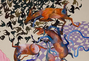
 Above images: {Shahzia Sikander}
A small discussion about the difference between gouache and acrylic.
Betsy Walton
Justin Richel
Thursday, January 8, 2009
Monday, January 5, 2009
Holy Comixtravaganza!
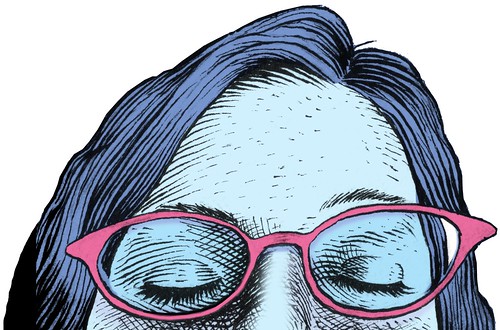
Early bird extra credit opportunity-- attend the lecture by David Lasky that kicks off Comixtravaganza tomorrow night at the Ballard branch of the Seattle Public Library. Take notes and write a single page for your own personal growth and education, but then hand it in to me to start your quarter with some extra school-style points.
Kick-Off with David Lasky
6:30 p.m. Wednesday, Jan. 7
Ballard Branch
5614 22nd Ave. N.W., 206-684-4089
Thursday, January 1, 2009
welcome!
 (image: "This Flooded World" Sarajo Frieden)
This is your entry point into an ongoing blog dedicated to Seattle Pacific University Illustration courses taught by Gala Bent. Feel free to browse back in time and let me know if you have any great links for illustration or illustrators. I look forward to another semester of engaging work from talented students. Sis boom bah, rah rah rah!
Subscribe to:
Comments (Atom)

